
We’re Enchant, and we’re laser focussed on building customer centric products that people love to use. If you find yourself in need of better customer communication tools, check out Enchant!
A decent app helps you get the job done.
A good app helps you get it done faster.
A great app, however, makes it effortless.
… and those apps, the ones that make things feel effortless, are the ones we love the most.
But what makes an app feel effortless?
More importantly, how can you make your app feel effortless?
These are the questions I hope to answer in this post.
The secret sauce
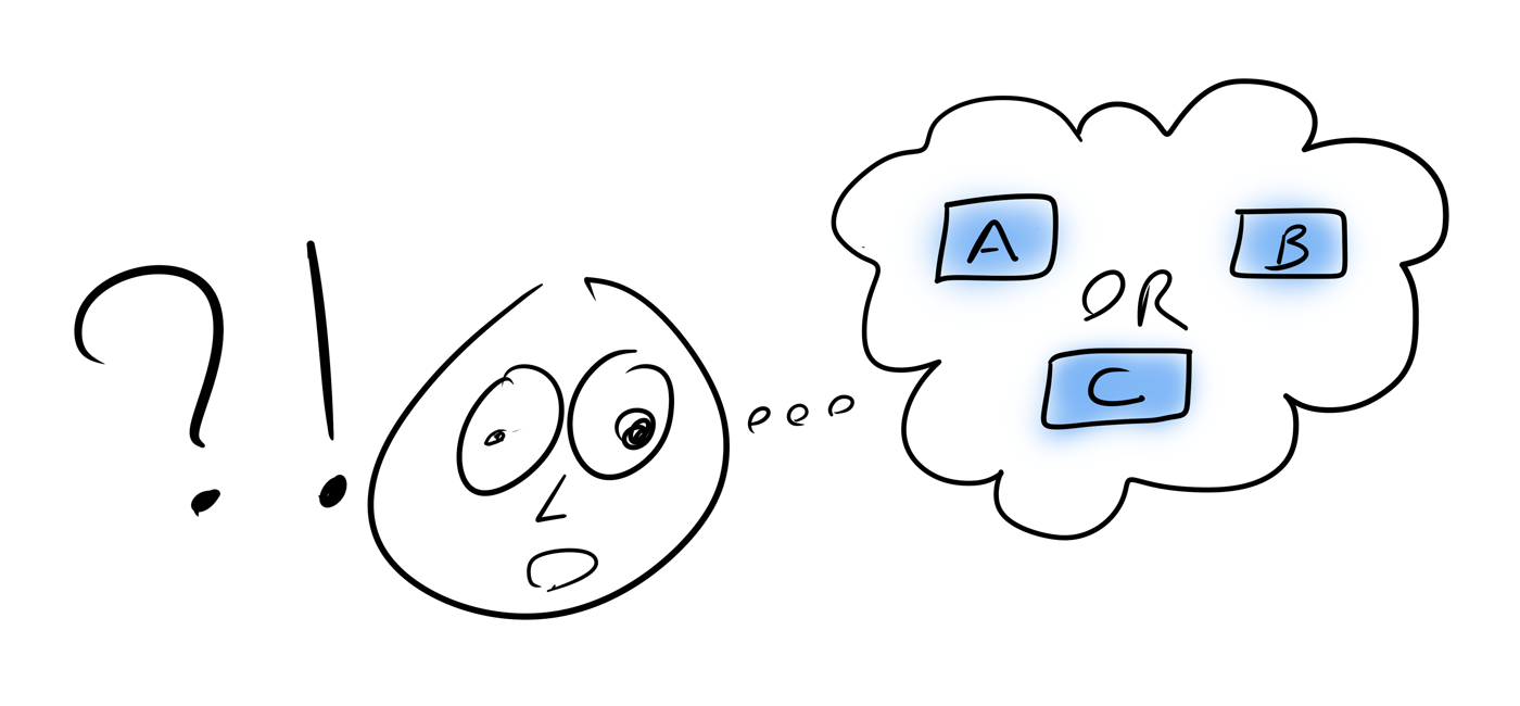
So you’ve stumbled upon one of those great apps that makes everything feel effortless.
What is their secret sauce?
Let’s break it down:
- The app is self explanatory. The most common things you would need or want to do are obvious. The uncommon things are still possible, but maybe a click or two away.
- The app doesn’t make you think too much. There is a natural flow from start to finish. The next step is always obvious.
- The app inspires confidence. When you interact with it, you know exactly what will happen. At all times, you’re in control.
There’s a common theme behind all of these: clarity.
The user is clear about the available options.
The user is clear about the next step.
The user is clear about the expected result of their interactions.
Clarity is the secret! It’s the key to building apps that feel effortless.
Clarity as a feature
Your app gains functionality over time. A button gets added here and a toggle over there. All these little additions improve your app, each in their own little way.
This is a good thing, right?
Well… maybe.
You see, those extra buttons and toggles are all things that the user has to think about. What does each thingie do? Which thingie should they use? When should they use the other thingie?
As a result, each of these extra things adds a little bit of complexity.
But complexity leads to confusion… and confusion is the opposite of clarity.
To evolve your app without making it more confusing, you need to consider clarity at every step of the way. It can’t be an afterthought.
To pull it off, clarity must be a feature. A core feature. A critical feature.
Not the kind of feature that your marketing team will care to talk about. But one of the most valuable features nonetheless. Research shows that 1 in 3 users get frustrated when an app isn’t intuitive or easy to use. That’s definitely not an experience you want your users to go through.
31% of customers get frustrated if a digital service isn’t intuitive or easy to use.
Identifying clarity issues in your app
You can ask your team to do their best to keep clarity in check and try to get it right the first time.
But they’ll miss things… and it’s really not their fault. They just know the app way too well. To them, there’s never any confusion… and if they don’t feel the confusion, they won’t know there’s a problem to fix.
Let’s look at some approaches you can use to surface issues with clarity in your app:
Listen to your customers
While your team may think something is extremely clear and obvious, it can be an entirely different story when an outsider (like a customer) encounters it.
At Enchant, we’ve taken this to heart.
Whenever a customer reaches out to support while struggling to do something we know is possible, we treat that as a clarity bug.
For these clarity bugs, we ask ourselves a number of questions:
- Is there too much clutter on the interface?
- Was what they needed to do not in an obvious location?
- Were the words on the interface not clear?
- Was the help text not sufficient?
The support requests which identify clarity bugs tend to come from the least tech savvy customers… and that’s a good thing. If you can improve clarity enough that the least tech savvy can figure it out, then the rest will have no issues at all.
Documentation shouldn’t be a required reading
You know those places in your app where you need to use a lot of words to explain what’s going on? Those places where the customers would do the wrong thing if they didn’t read the words carefully.
In those places, the purpose of the words is to make things more clear… and they do for some people.
But the problem is that there are many other people who just won’t read them at all, even though they’re right in front of their eyes. Those people just get confused.
You see, the words on those “overly wordy” screens tend to be a band-aid solution to an underlying clarity problem.
Those places in your app are great candidates for being ripped apart and re-imagined.
Observe new customer experiences
Confusion is at it’s highest when someone is experiencing something for the first time.
The first time someone uses your app, for example.
Or the first time they try out a specific feature.
For these kind of firsts, you need visibility into what’s really happening. Where are they clicking? Are they going back to see what they entered on a previous screen again?
One way to gain visibility is to analyze web server logs. Another is to use software that captures and reconstructs mouse/keyboard activity.
Either way, your goal is visibility. With the visibility in place, you’ll see that some customers progress smoothly and others struggle. It’s those moments of struggle that we can learn the most from.
Identify the specific interfaces where more people struggle. Those are the areas where clarity can be improved.
Don’t confuse clarity with simplicity
For most people, the obvious way to avoid confusion is to focus on simplicity. Keep the app simple and the user doesn’t get confused.
This can work for some apps, especially where the problem they solve is also simple.
But simplicity isn’t the complete answer to clarity. The underlying problem with simplicity is that it implies removing functionality. Stripping things down to it’s bare essentials.
The challenge here is that stripping functionality is usually not in line with your goals. You want the user to be able to use your app for all their use cases. You want the functionality there. You just need it to not be confusing.
What you really need to do is organize things better:
- Make the primary actions easily accessible.
- Add help text in the right places.
- Subtly guide the user through the most common flows.
Smarter organization is the key here, not simplicity.
Improving the clarity of your app
When designing (or re-designing) an interface, there are a number of things you can do to improve clarity.
Let’s dive right in:
Leverage the user’s instincts
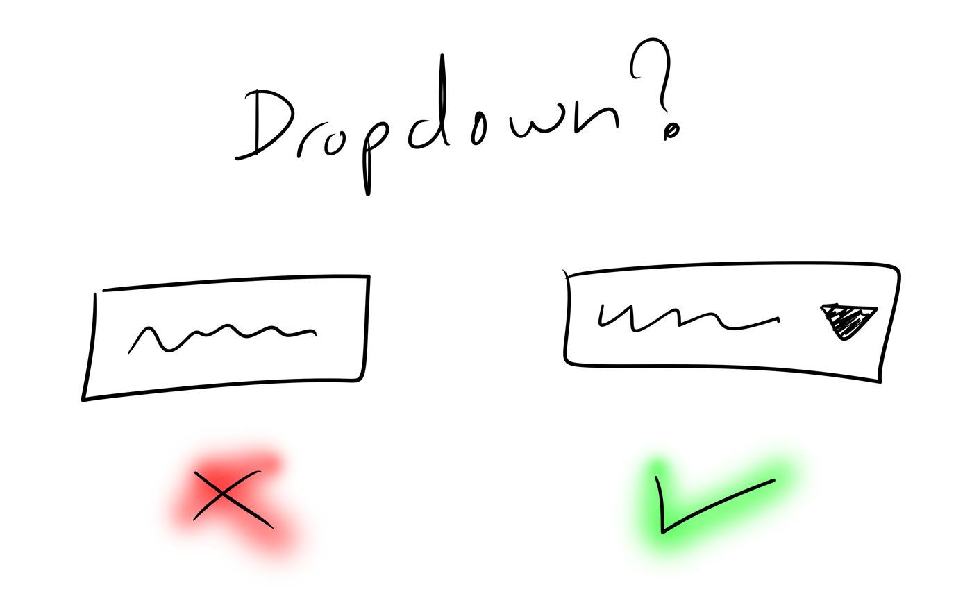
The user should be able to instantly tell what can be interacted with.
A button should look like a button. If something pulls down a menu, this should be apparent before clicking on it.
When things are familiar, the user knows exactly how to interact with it. There isn’t much to think about. This improves confidence and keeps interactions feeling natural.
But wait: the user’s instincts (i.e. what they’re familiar with) are a moving target. When enough apps start doing something one way, that approach becomes the new expectation. Something to watch out for as your app evolves!
Consistency matters
If something is a dropdown on one screen, it should be the same on another.
If you order items descending by default on one screen, do the same on others.
You see, when someone is exposed to one screen in your app, they build up an understanding of how things work.
You want to leverage that understanding.
Consistency is the key here. When the screens are consistent with each other, the user isn’t forced to think and is able to progress quickly and confidently.
The real challenge, however, is maintaining consistency when multiple people are working on the app. Here, having some documented style guidelines can help.
Be predictable
Sometimes, in an attempt to “simplify” and reduce interface elements, an app combines multiple actions into a single button. But it does different things based on the state of the system at the time.
As an example, consider the post editing page of a blogging app. It has a save button. If the post has already been published, then the save button not only saves the post but also re-publishes the post to the public site.
Now comes along a new team mate that’s been tasked with updating some content on the blog. He’s prepared the changes, but wants someone to review his changes before he publishes.
To him, it’s not clear what save will do. Will it just save the text so he can then send a link to someone? Will it automatically publish it too? Will he even think this far or just learn the hard way?
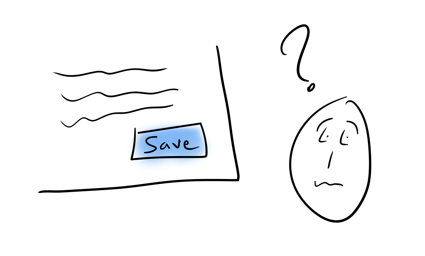
Sometimes, even a harmless save button can be a source of confusion!
A more clear interface would have had a save button and a publish button side by side. The publish button is always there but disabled if there’s nothing to publish.
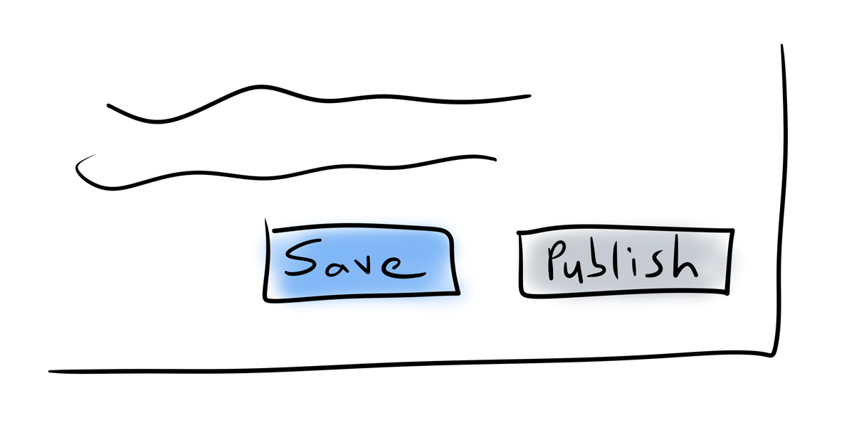
Now, the user can build up some assumptions at a quick glance:
- Save definitely doesn’t publish. There’s a publish button for that!
- Since the publish button is disabled, there’s nothing unpublished for this post right now.
- When the save button is pressed, the publish button should be enabled, providing visual confirmation of saving. At the same time, the save button should also be disabled, since the changes have been saved.
The user needs to be able to anticipate what will happen when they interact with an interface.
This kind of predictability keeps the user in control and increases their confidence with the app.
Use words effectively
Words are part of the design; not things that fill in boxes after the design is done. This is an important distinction. Poorly chosen words make an interface harder to understand. They add to the confusion.
So here’s what you do:
- Write less words: Be concise. Use short sentences.
- Write simpler words: Use common words that all levels of readers can understand. Avoid overly technical terminology.
Basically, you need to find the simplest combination of words that express the concepts effectively.
Give the user feedback when they interact
When the user interacts with an interface, they need to know that something has happened. They should get some visual feedback and it should be instant.
If they see nothing, they may think something went wrong and try again… which, depending on your app, that may even create a duplicate action and dig them deeper into a pile of confusion.
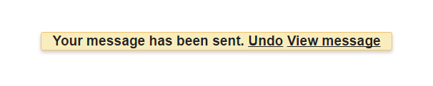
If there’s something on the screen that changes with their action, it should get updated immediately. Otherwise, you need to let them know that the work is done some other way. One popular approach is a floating status window, like what the gmail webapp displays right after you send an email.
But what if you need to do something in the background?
Waiting for the server to respond before providing feedback to the user is a bad idea.
You absolutely need to let the user know something is happening. A small inline spinner is a good fit here. Or grey out the button they just interacted with. Or show a message stating what’s happening (“Saving…”).
Whatever you do, just don’t leave the user hanging.
What about optimistically updating the interface?
Since an update to a backend server will succeed 99% of the time, some apps update the user interface before getting a response from the server. This kind of optimistic update feels very very fast to the user.
However, you need to be very careful with how you handle that last 1% of scenarios where things fail.
I was recently using a web app that uses optimistic updates. I clicked a button to complete an action and because it was an optimistic update, it appeared like the action went through. So I closed my browser. Behind the scenes, the action had actually failed and I closed the browser before any notification was shown. The end result is that I never got any notification of that failure. I only noticed the action didn’t actually happen when I opened the app again on another day.
This experience only left me frustrated and feeling less confident about the app as a whole. I never know if what I’m doing is actually happening or not.
That said, I’m personally not a big fan of optimistic updates. I think they’re best left for non-critical actions.
Use familiar icons
Some designers get carried away with design trends and end up reducing clarity for better visuals. Don’t do that!
An icon is only effective if it expresses an idea clearly. The user should know what it means just by looking at it.
There are some icons people are very familiar with. Those are the ones they use every day in other apps.
You want to leverage that familiarity. When you’re expressing a common idea (like “home” or “location”), use icons that the user already knows.
This will help the users feel at home in your app. They’ll spend less time thinking about how to do something and more time actually doing it.
Primary actions visible, secondary actions nearby
There are actions that are used all the time and those that are used only sometimes.
Those occasional actions, the ones that are used sometimes, shouldn’t be taking up precious real estate (on the screen and in the user’s mind - both very important and very limited!).
But those actions still need to be around… somewhere. The simplest and most popular approach here is to push them into a drop down menu near the primary actions.

Similar actions close together
When you have a bunch of actions that all apply to the same thing, they should be located close together. Similarly, actions that don’t apply to the same thing shouldn’t be located together.
The goal here is to let the user build up their muscle memory.
Depending on what they need to act on, they’ll know exactly where they need to go. Then they just need to pick the specific action they care about.
Provide contextual help
While it’s a good idea to have documentation available, a user shouldn’t be forced to go hunt for the right documentation to figure out how to do something.
Instead, give them some contextual help text. There’s a lot of value in it!
If you’re wondering what “contextual help text” is: it’s when you have little nuggets of information accessible directly on your app’s interfaces. Sometimes the help text is always visible (like when under a form field), other times it’s hidden behind an icon or toggle of some kind.
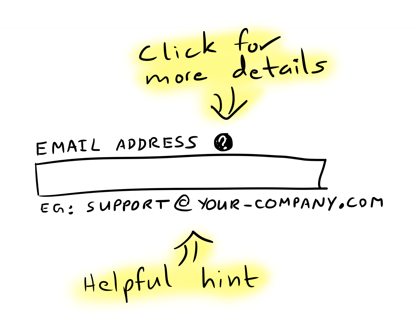
This kind of help text nudges the users in the right direction. Sometimes that’s all they need to figure things out themselves.
You know what’s great about a tiny bit of help text that keeps the user moving forward?
To them, it doesn’t feel like help at all! They were able to do what they needed to do without changing focus… and that, my friends, is a wonderful thing.
Guide the user to the next step
Every app has a natural path.
At every step of the way, the path forward should be highlighted. In other words, the element that takes the user forward should be emphasized.
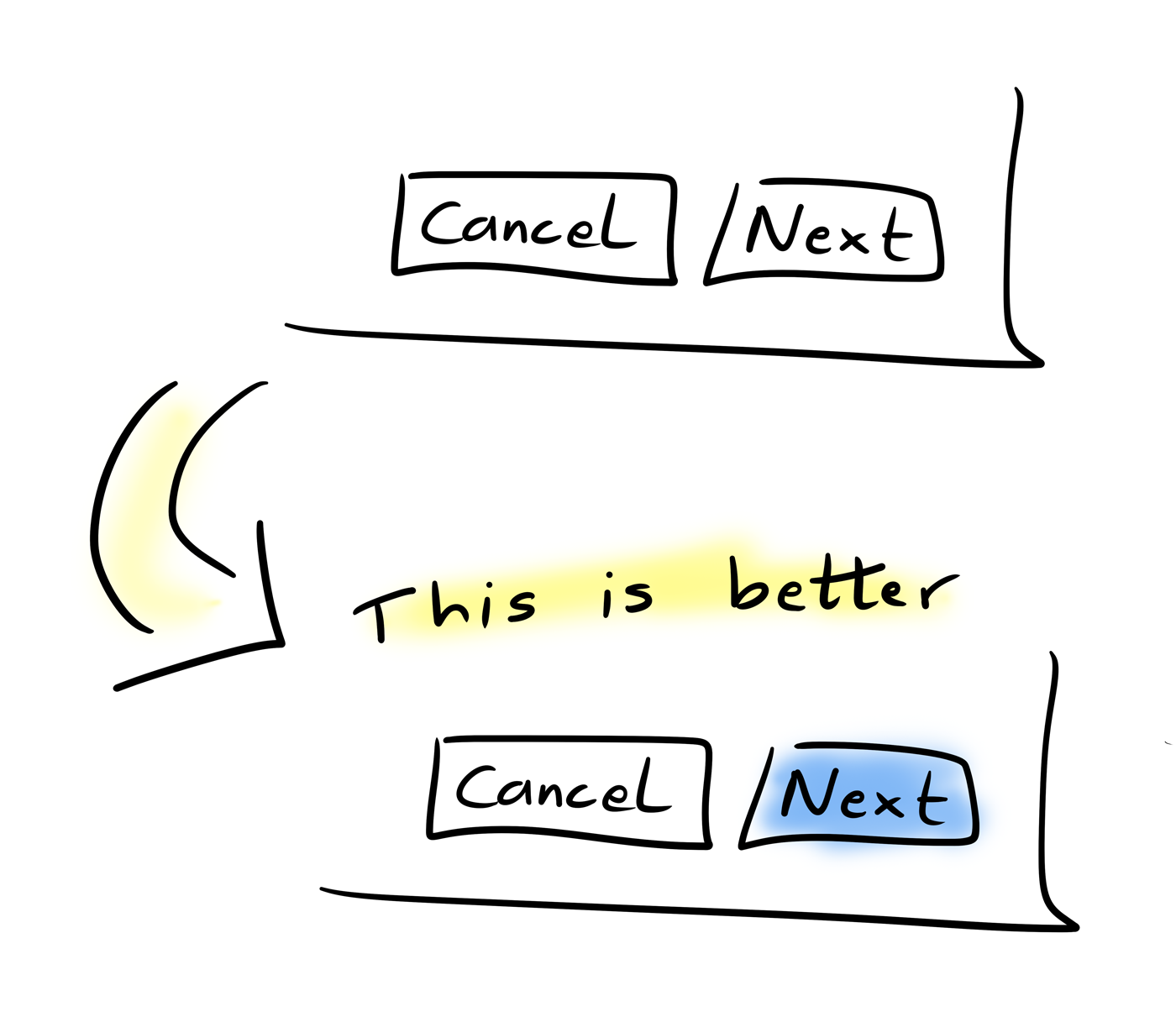
This helps users do the right thing without having to think about it. They’ll instinctively find the highlighted button in a sea of plain ones.
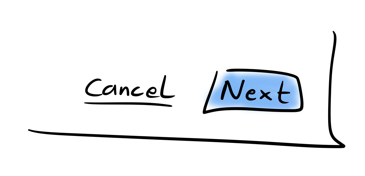
Sometimes it also makes sense to go a step further and de-emphasize the uncommon actions.
As an example, a “cancel” button in a multi-step form could be de-emphasized by making it a simple link. The action is still there, just with less visual weight than the other buttons.
Keep the user in the flow
Let’s say the user is typing up an email in gmail. He notices that the name associated with the person he’s emailing is wrong. He wants to correct the name and then get on with his email.
He could go find the contact in the contacts app and update it, but then he’ll likely lose track of what he was doing in the first place.
It would be much better if he could edit basic contact details right from where he is (in the email editor). Maybe pop up a small window with editable contact details. Once saved, the window goes away and he gets on with his email.
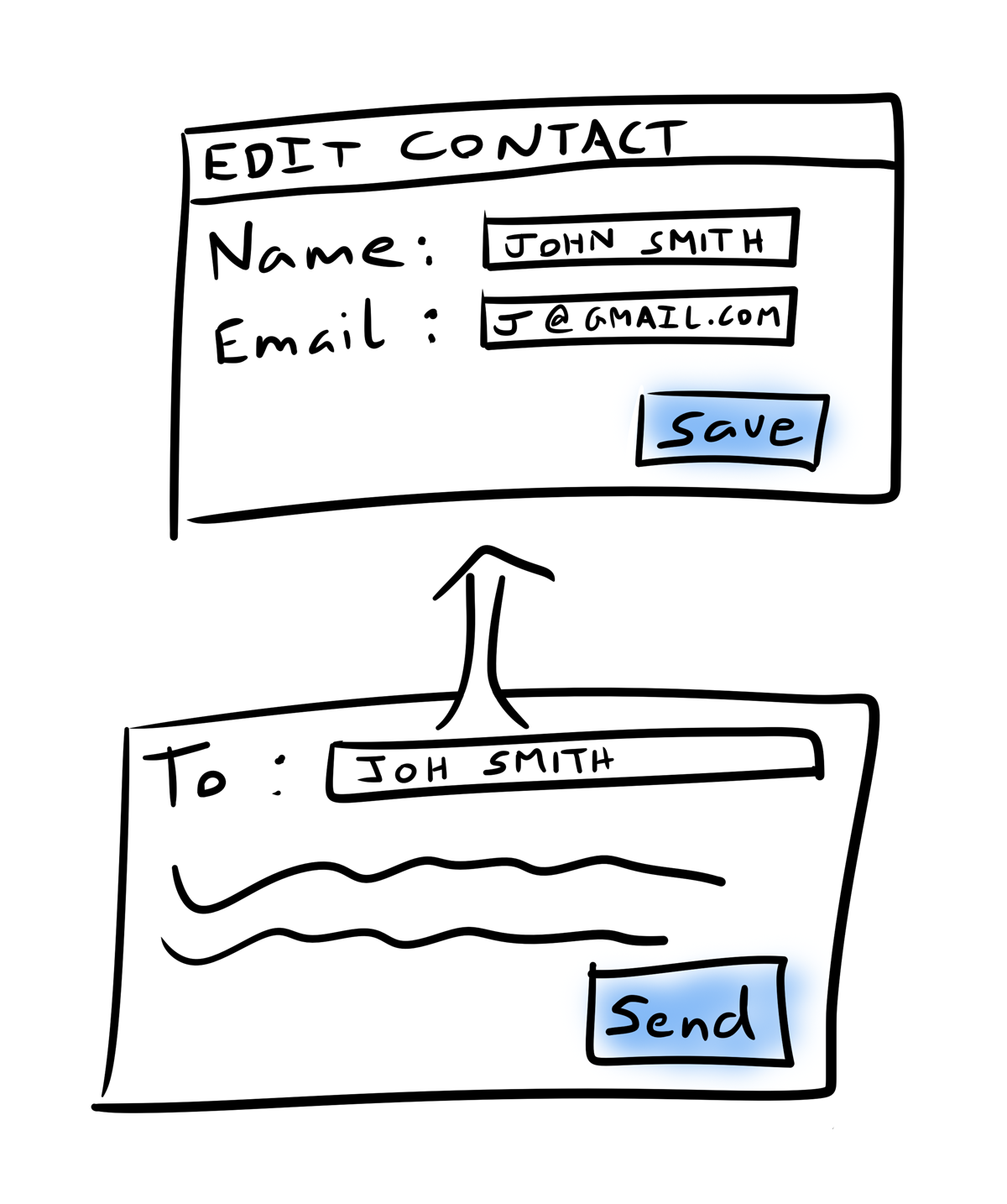
This way, we’re keeping the user in the flow and letting him do the related task inline and in context.
Most importantly, this approach minimizes the amount of effort it would take the user to get back to what he was doing.
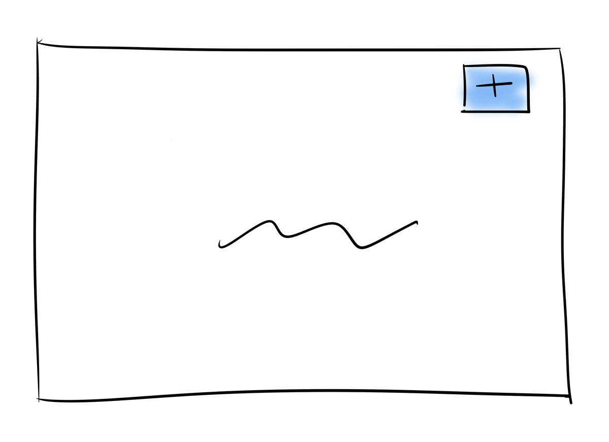
Educate on a blank state
On screens that show a list of things, you sometimes start with an empty list. Typically, the screen will say something like: You haven’t created any yet. Create one now?
These mostly blank screens are quite common in apps. Unfortunately, they’re also big missed opportunities.
You need to understand why the user hasn’t created any:
Do they know what it does?
Do they know why or when they would want to create one?
Do they know what will happen when they start the creation process?
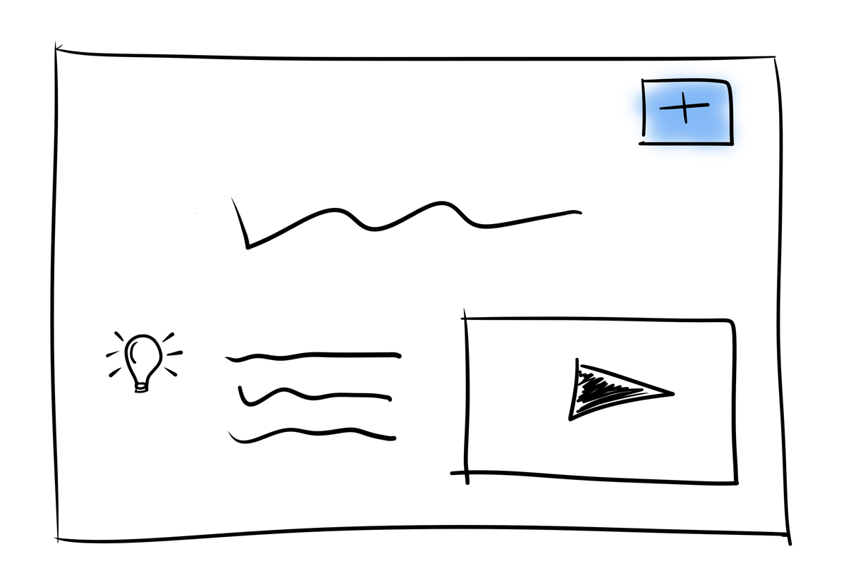
Instead of stating the obvious (i.e. there’s nothing here), it’s much more useful to use this as an opportunity to educate the user.
Offer a video that explains the functionality.
Show examples of common uses of the functionality.
Point them to documentation of more interesting uses.
This way, you’re offering help and guidance to users who need it the most (i.e. those who are unfamiliar with the functionality) in the moment when they’ll actually need it.
Be forgiving
People make mistakes.
You can try hard to make sure an interface is clear and that the users know what they’re doing. It doesn’t matter, they’ll still end up doing things they didn’t mean to.
So, in addition to making things clear, you need to make sure there’s some way for the user to back out of any unintended actions.
When they create something, make sure they can delete it.
When they switch a state, make sure they can switch back.
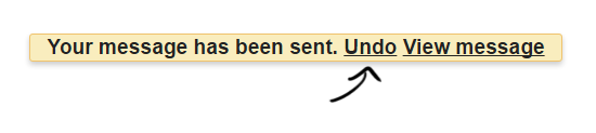
Offer an Undo button for a few seconds after they complete an action.
But not everything can be undone. What about those?
There are two common approaches here:
Use a confirmation screen: If something really can’t be undone, ask the user for confirmation before doing it.
For the really dangerous actions, forcing the user to enter something specific into an input box can help. You’ll know that they at least read what was on the confirmation screen.
Add a short delay: If it’s common for a user to want to undo something that really can’t be undone, one interesting option is to add a delay before actually doing it. Offer the user an undo action during the delay.
This is similar to how an email system like gmail offers the ability to undo sending an email after you hit the send button.
Surface what’s important
When there’s a wall of text, its hard to figure out what’s worth looking at.
But you can simplify it for the users by making the most valuable information easier to find.
Some good practices:
Value on the top: Since we always start at the top of a screen, keep the most valuable information at the top.
Value on the left: People read left to right. Keeping the most valuable information on the left minimizes the amount their eyes need to jump around.
Of course, this one can be flipped around if you’re working in a right-to-left language.

Make relevant words more prominent: A little bit of bold. An increased font size. A slightly darker text color. These are all subtle tricks which do the job.
Collapse the least valuable: Collapse the least valuable information behind a button/link, especially if it’s only relevant to some users some of the time.
Break things down into steps
Nobody likes big scary forms. They make things feel harder than they really are.
When you have a complex process, it’s best to break it down into small steps.
For each step, disclose only what’s needed to make an effective decision. Trim anything unnecessary.
This keeps the process feeling simple… and keeps the user moving forward steadily.
Pick good defaults
The defaults in your app will make or break the user’s first experience.
Everything in your app may be configurable. But if it doesn’t feel right when the user first tries the app out, then all that configurability won’t matter. He’ll will still walk away thinking the app isn’t a good fit.
So what’s a good default?
A good default is the one that would be most usable for most of the users.
You have opinions about how your app should be used. Your defaults should represent those opinions.
… and what’s a bad default?
The least opinionated defaults are the bad ones.
Doing nothing is not better than doing the opinionated thing.
I’d go as far as saying that doing the least opinionated thing (i.e. nothing) usually makes an app appear less interesting and less valuable.
Takeaways
- The most loved apps feel effortless. Clarity is their secret sauce.
- While it takes a lot of effort to make an app feel effortless, it’s an investment worth making.
- Your support team should be trained to identify clarity issues in the requests they’re handling.
- Clarity must be a core feature, not an afterthought.